Most people don’t realize how much design matters when it comes to choosing snacks. Shoppers are surrounded by so many options, and they often make choices fast. In these quick moments, the way a snack looks can be just as important as how it tastes. Bright colors, fun shapes, and clean looks all catch the eye. Kids may grab what looks fun, while adults might go for something that looks healthy. The design is the first message a product sends, even before someone takes a bite. In a busy store or online shop, the design helps a product stand out. This article looks at how snack design plays a big role in what people pick, and how smart packaging, like custom popcorn boxes, supports that choice. Companies and even small sellers need to understand these trends to keep up in today’s snack world.
The Psychology Behind Snack Design
Colors and shapes speak a quiet language that shoppers understand without thinking. A red wrapper might mean something bold or spicy. A green package often makes people think of health or nature. Shapes also send messages. A round snack may feel soft or sweet, while a sharp-edged treat might feel crisp or crunchy. Texture adds more to the story. When people see a snack with a rough surface, they often expect a crunch. If it’s smooth and shiny, they may think it’s chewy or soft. These signals happen fast, in seconds, and can push people toward buying something without even tasting it. This kind of snack design works because it links directly to how the brain responds to sight and memory. Even small changes in the design can change how a product is seen. For brands, using these ideas can lead to more interest and better sales.
Design Elements That Affect Purchase Intent
A snack might taste amazing, but if it doesn’t look right, many won’t try it. One of the most helpful things is letting people see the snack. See-through windows in the packaging help with that. It gives shoppers a peek at the actual product. That builds trust. Size also matters. Bite-sized snacks often do well because they feel easy and fun to eat. Shapes can attract different types of customers. Fun shapes like stars or animals can draw kids in. Simple or clean shapes can work better for older shoppers. Color themes also change based on the target buyer. Bright colors tend to attract younger people, while soft or earth tones appeal more to adults. Together, these design choices affect what goes into the shopping cart. When brands get this part right, they don’t have to rely only on taste to win customers.
Cultural Preferences and Market Trends
Different places in the world prefer different snack styles, and design reflects that. In Japan, for example, snacks often look like little works of art. In the U.S., designs are bolder and usually have a clear message or flavor on the front. These cultural habits shape how snacks look and how companies sell them. Seasonal designs are another smart move. People enjoy snacks that match the time of year. Fall-themed snacks with leaves or warm colors can feel cozy. Winter snacks may use snowflakes or holiday symbols. Limited-edition looks help make a snack feel special. This pushes people to buy now rather than later. Trends can also move fast, so companies often change designs to match what’s popular. If a cartoon or a movie is hot, a snack might use that image for a short time. These fast changes keep shoppers interested and coming back for more.
Packaging vs. Product: Which Has More Influence?
It’s easy to think that the product itself is all that matters. But many times, packaging is what pulls someone in. If the design isn’t strong, people may never even try what’s inside. A great snack with weak design might not get noticed. Good packaging can act like a friendly greeting. It tells people what to expect and makes the snack look safe or fun. When the product and packaging work together, the effect is stronger. For example, a crunchy chip with sharp branding and bold colors makes sense. A soft cookie in a gentle, smooth package feels right too. Some brands even create characters or logos that people connect with. Over time, this builds trust. That trust brings customers back. Packaging doesn’t need to outshine the snack, but it should speak the same language. A strong match between product and packaging helps people feel more confident in their choice.
Snack Design for Different Age Groups
What works for a 10-year-old won’t always work for someone who is 30. Younger kids look for colors, cartoons, and playful shapes. Snacks that seem fun and easy to eat do well with this group. Teens might enjoy trendy packaging that feels new or bold. Older adults might prefer something that looks clean and trustworthy. They also care more about what’s in the snack. If it says "low sugar" or "whole grain," the design should match that mood. Fitness fans, no matter the age, go for snacks that look healthy and natural. The design might use green or beige colors and focus on ingredients. Brands need to think about these details when launching a snack. If they miss, they may lose out on the people they want to reach. Good design doesn’t just happen. It takes knowing the audience and giving them what they expect to see.
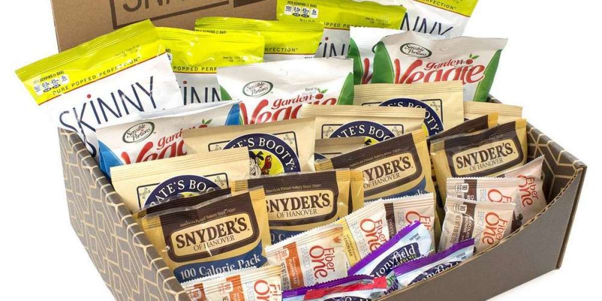
Custom Snack Solutions That Drive Sales
Some snack makers try one-size-fits-all designs, but that rarely works. Custom design allows brands to shape the snack experience around their buyers. This could mean using different shapes, colors, or wrapping styles depending on the market. When a brand listens to feedback, it can change the design to match what people want. Maybe customers say a snack is hard to open or looks boring. Those things can be fixed with custom changes. This is where testing becomes important. Brands often try out a design in small markets first. If it sells well, they launch it to bigger areas. This saves money and helps avoid big mistakes. Smart snack design also helps companies tell their story. A snack made from local fruit might show that clearly on the pack. A product made for kids might show safety icons. These small touches make a big difference in how shoppers react.
The Role of Packaging in Reinforcing Snack Design
Once the snack itself is planned, the packaging brings it to life. A smart package shows off the best part of the snack. It also keeps it safe, especially during travel or while sitting on a store shelf. Custom snack boxes do more than just hold the snack. They are part of the whole product. They help set the tone. For example, a strong box with a clean design might make the snack look high-end. A colorful, light box may make it feel more fun or easygoing. These choices matter to customers, even if they don’t think about it out loud. The size and structure of the box also help. A well-sized box keeps snacks from moving around or breaking. Some boxes open in fun ways or can be reused. That adds value. When done right, the box and the snack become one single idea that’s easy to remember.
Conclusion
Snack design isn’t just about looks. It shapes how people feel and what they buy. From color to shape to packaging, every part of the design adds to the story. A smart design speaks directly to shoppers, making them more likely to try and return. Whether the snack is for kids, adults, or health-conscious buyers, matching the design to the group matters. Brands that understand this can build trust and grow faster. The snack itself is the heart, but the box is the handshake. That’s why tools like custom snack boxes help complete the picture. If a brand wants to stay ahead, it needs both good snacks and smart designs. For businesses that want help with that part, Packlim offers support by making packaging that works with the snack, not against it.